
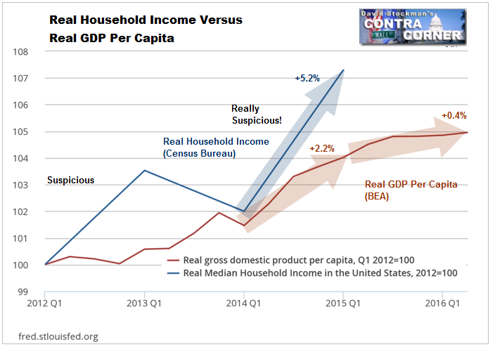
The US Government publishes lots and lots of economic data, much of it conflicting, and much that’s highly suspicious. We know that the Household Income data released this week was suspicious, but I could not quite figure out what the problem was. I had surmised that it was due to an increase in household size, or a family member getting a first job or taking a second job, hardly a sign of workers and households improving their lot in life. The government’s methodology in collecting, repurposing, and reporting the data is so obscure however, that we can’t definitively identify the source of the absurd 5.2% reported annual increase in real household income.
To illustrate, I’ll take you through some of the ideas I tested to try to find an explanation. Even though those exercises did not clear up the problem, they are enlightening, showing clearly that government data can’t be trusted for any specific short run time frame from a year to several years.
One of the things that I questioned was the issue of household size. The Census Bureau reported in its annual report on Income and Poverty that the number of households increased by 1% in 2015, to 125.8 million from 124.6 million. They also reported that average household size was virtually unchanged at 2.53 persons per household vs. 2.54 in 2014. This indicated that the gain in household income could not have come from an increase in household size.
Unfortunately, between the decennial census years, neither population, nor households, or average household size are actually counted. The interim years are all based on government statisticians’ projections, otherwise known as wild guesses. Essentially they project the past, shaving or adding a few fractions of percent here and there to make it look as though their estimates mean something. We won’t know how accurate current estimates were until the data from the 2020 census is fully amalgamated and reported in 2023. For example, the Bureau lowered the 2002 estimate of the number of households by 3.5 million, or 3.6%, after looking over the 2000 census data. In other words, average household size was actually 3.6% larger than they thought (assuming they counted everybody… haha).
There’s another problem. The Census Bureau keeps 2 sets of books, one for its Income and Poverty report which reported 125.8 million households in 2015. The other is for its annual Housing and Vacancy survey. The number of households reported in that report is based on the estimate of occupied housing units derived from a small sample survey conducted quarterly. The assumption is that there is one household per occupied unit. It showed only 117.2 million households in 2015. That’s 8.6 million less than in the Income and Poverty report. Where’d they all go? Under the bridges on I-95?
Nevertheless, the year to year change in the number of households in the H&V survey was an increase of 1.4% with virtually no change in household size. So this would not explain the increase in reported household income either.
Unfortunately, both estimates of the number of households are suspect. The number of households in the Income and Poverty report increased by 6.9% since the recession bottom of 2009. In the Housing and Vacancy survey, the number of households increased by just 4.8%. That’s a huge difference that calls into question the accuracy of one or both of the surveys. The discrepancy in total number of households between the two surveys is another reason to question their accuracy. Finally, there are the big revisions after the decennial census. The bottom line is that the annual estimates of the number of households are probably sheer nonsense. Which makes household income estimates likely to be nonsensical in any given year. 2015 was one of those years.
What about the idea that maybe household size didn’t change, but household members got their first job, or took an extra job? Let’s assume for a moment that the Income and Poverty report estimate of the number of households is reasonably accurate. It’s easy enough to calculate the number of workers per household. Just divide total nonfarm payrolls by total households.
This exercise did not explain the increase in household income either. The number of jobs held per household only rose from 1.12 to 1.13. However, jobs per household did rise from 1.09 in 2011 to 1.13 in 2015, an increase of 3.5%. That accounted for nearly half the gain in reported real median household income over that period.
But it still does not explain what happened to cause the reported nominal 5.7% gain in median household income and 4.7% in mean household income in 2015 alone. We have already ruled out that it came from wages and salaries. They have barely increased at all, year to year. It remains “a riddle, wrapped in a mystery, inside an enigma” as Winston Churchill once characterized the Kremlin, an apt analogy for US government data factories.
An alternative means of looking at household income comes from BEA data. The BEA data clearly calls into question the Census Bureau’s data. The BEA reported that Total Disposable Personal Income (DPI) rose from $13.0 trillion in 2014 to $13.5 trillion in 2015. That’s a more inclusive figure than the Census Bureau calculation of total money income. Using the Income and Poverty Report number of households, the gain in the BEA’s DPI per household was just 2.8% from 2014 to 2015. How can that be when the Census Bureau reported a 4.7% gain in mean household income? Somebody’s data is more wrong than the other guy’s. The evidence points to the Census Bureau being the culprit.
The discrepancy is even more glaring using the household count from the Housing and Vacancy Survey. In that case the nominal gain in DPI per household was just 2.3%. Deflated by the Stockman Flyover CPI for 2015, the real, inflation adjusted increase in DPI per household was just 1.15%. That’s a far cry from the Census Bureau’s 4.7% in mean household income and 5.2% on median household income.
The fact that the mainstream media reported the Income and Poverty report data with straight faces is mind boggling. Where’s the analysis? Where’s the honest journalism? Their reporting wasn’t journalism. It was propaganda. It’s establishment PR. It’s garbage. The Census Bureau numbers didn’t pass the smell test on their face. But Wall Street’s cheerleaders went out and did their thing, pretending that the numbers were meaningful.
Finally we’re left with the question of where we are now in the third quarter of 2016. The BEA is kind enough to provide us with monthly estimates of personal income and population. The BEA data shows that the DPI per capita increased by 2.8% between July of 2014 and July 2015. Adjusted by CPI, the real gain would be 2%. However, using core CPI the real gain would be only 0.6%. Given that a significant change in household size would be unlikely over one year, that figure would also apply to household DPI
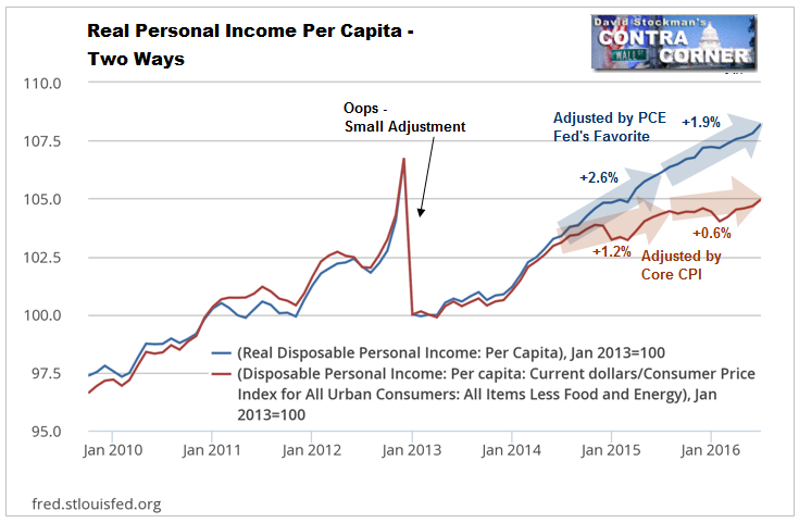
The BEA’s own deflated data almost certainly overstates real gains because its deflator is the most suppressed of all inflation gauges, the PCE deflator. However, even given that, its data still contradicts the Census Bureau household income report. The BEA showed DPI per capita rising by 2.75% in 2015 in real terms and by 1.88% through Q2 2016. Throwing even more shade on the Census Bureau 5.2% figure, the BEA shows real GDP per capita increasing by just 2.2% in 2015 and by 0.4% this year. That data is as current as it gets, and hardly anything to cheer about.
Making matters, worse, current withholding tax collections through mid September (which I track in the Wall Street Examiner Pro Trader Federal Cash Flows Report), show income gains no better than in the second quarter. The weak economic data that we have seen for August is likely to be a harbinger of things to come in September.
No matter how you slice it, the reported gains in household income in 2015 look suspect, if not laughable. But the bigger story is that here in 2016 whatever gains occurred in 2015 have gone by the wayside. The story that the US recovery is broadening to include a wider spectrum of American households is just more mainstream economic propaganda that doesn’t pass the smell test.

