
The Fed issued its monthly report on Industrial Production (IP) levels last week. Here’s how the Wall Street Journal couched its report:

WASHINGTON—A drop in U.S. manufacturing output held back overall industrial production in May, an indication of uneven growth for the factory sector and only modest expansion for the overall economy.
Industrial production—a measure of output at factories, mines and utilities—was unchanged from the prior month.
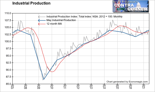
As with virtually all economic data, the mainstream media always reports the data on industrial production (IP) on a seasonally adjusted basis, in spite of the fact that the Fed also reports the data on an actual, not seasonally adjusted (NSA) basis.
The Fed summarized the SA data:
Industrial production was unchanged in May following a large increase in April and smaller increases in February and March. Manufacturing output declined 0.4 percent in May; the index is little changed, on net, since February. The indexes for mining and utilities posted gains of 1.6 percent and 0.4 percent, respectively, in May. At 105.0 percent of its 2012 average, total industrial production in May was 2.2 percent above its year-earlier level.
I prefer the NSA data because, first, it is actual. Second, it is not subject to the error inherent in seasonally manipulated data. Frequently, the result of the seasonal adjustment process is to misrepresent the actual trend. Seasonally adjusted data is adjusted twice in the two ensuing month, and then in each of the next 5 years as the data is benchmarked to actual performance as the data becomes available.
The market focuses only on the initial report, ignoring subsequent revisions that more accurately fit the trend. By plotting the actual trend on a graph, we can better see that trend, and stay a step ahead of the market.
Industrial production is an index based on the production level of the year 2012 being 100%. The current reading is represented as the percentage of 2012 production. It need not be adjusted for inflation because it is based on the unit volume of production as opposed to the value of production. The overall index includes the output of factories, mines—including oil and gas production, and utilities, including electricity and natural gas utilities.
Utilities production is particularly useful because all sectors of the US economy use electricity and gas. This includes the not just the industrial sector, but also the commercial and household sectors. Therefore utilities production is a good proxy for the US economy as a whole. Winter and summer months may have unusual weather affects. US temperature data is available to account for that. May, as a temperate month in most of the country would typically be less skewed by temperatures higher or lower than average.
We’ll look at utilities production in a follow up post, where I’ll also examine energy production vs. non energy, which most closely tracks US manufacturing production.
To judge the performance of overall IP in the current month we can look at changes in the growth rate relative to past performance. In that regard, the NSA data showed a month to month increase of 1.4% in May. That compares with a flat performance in May of 2016, and a 10 year average of +0.6% for the month of May. The 1.4% gain was the best May performance since May 2010, when the index jumped 2.1%. That was the first full year of the “recovery” from the 2008-09 recession.
Another way of looking at current performance is via the annual rate of change or “growth” rate. It hit +2.3% in May. That compared with an annual rate of +0.87% in April. May had the highest growth rate since a reading of +2.7% in January of 2015, when the rate was on its way down. Today the annual rate of change has been trending up since a low of -3.5% in December of 2015.
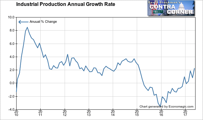
Clearly, IP was not unchanged in May, as the Journal dutifully reported from the Fed’s SA data. It was the strongest May in 7 years, and the annual growth rate rose to its strongest level in 2½ years.
Note that growth has been trending up only since the Fed started “raising” interest rates. The Fed has been increasing the rate of interest it pays on bank holdings of excess reserves, known as Interest on Excess Reserves (IOER). In reality, each increase in the IOER is an easing of financial conditions, as it pumps more money into the banking system and lowers the effective cost of funds for banks.
The rise in nominal short term interest rates actually normally would stimulate speculative business investment anyway. That’s because corporate decision makers accelerate their spending plans to beat the next increase in rates, and to ultimately do their spending before rates reach a level where they actually bite. We don’t know where that rate is today, but it’s certainly above CPI around 2%, and most likely above 4% or even 5%, which is where the economy typically began to slow in the most recent past tightening cycles.
But as I reiterate in every post where the report shows growth, “good” economic news is bearish because it will keep the Fed on a tightening path. More important than the phony tightening of increasing IOER, which is the Fed’s interest subsidy to the banks, it will keep the Fed on its announced course of reducing the size of the balance sheet. That’s what will generate the real pain in the markets. And that’s why you should begin to execute a plan of orderly exit now, before any panic begins.

