
Actual initial unemployment claims counted by the 50 states totaled 239,899 last week, which is another record low for this calendar week. It continues a nearly uninterrupted string of record lows that began in September 2013. We have been able to see and track this trend because we focus on the trend of the actual data instead of the seasonally manipulated headline number expectations game favored by Wall Street and its Big Media subsidiaries. Facts tend to be more useful than the economic establishment’s favored fictitious numbers.
The Department of Labor (DoL) reports the unmanipulated numbers that state unemployment offices actually count and report each week. This week it said, “The advance number of actual initial claims under state programs, unadjusted, totaled 239,899 in the week ending August 8, an increase of 15,795 (or 7.0 percent) from the previous week. The seasonal factors had expected an increase of 11,568 (or 5.2 percent) from the previous week. There were 269,468 initial claims in the comparable week in 2014.” Below is a 10 year chart of the actual data.

Click here to view chart if viewing in email
You can see for yourself from the chart just how extraordinarily low the recent numbers have been.
When using actual data we want to see if there’s any evidence of trend change. Thus we look at how the current week compares with this week in prior years and whether there’s any sign of change in the trend. The actual change for the current week was an increase of 15,800 (rounded). This week of August usually has a sizable increase more often than not. The 10 year average for the week was an increase of +8,500, including some years that were down this week. This year was better than 2014 (+21,600), but not as strong as the same week in 2013 (-6,100). It’s essentially a non event.
Week to week changes are noisy. The trend is what is important and it remains on track. Actual claims were 11% lower than the same week a year ago. Since 2010 the annual change rate has mostly fluctuated between -5% and -15%. This week’s data was right in the middle of that range. There’s no sign yet of a significant uptick in the trend of firings and layoffs.

Click here to view chart if viewing in email
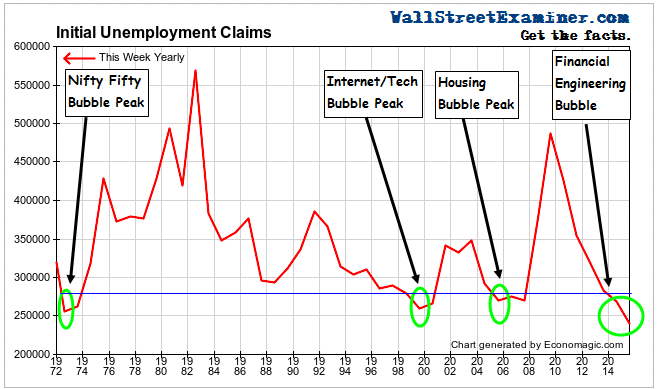
Population has been growing and the size of the workforce has as well, although not as fast as population. To get a better idea of how the claims data is performing over time, I normalize it based on the size of monthly nonfarm payrolls. Here’s where we can see just how extraordinary the current levels are. There were 1,692 claims per million of nonfarm payroll employees in the current week. This was a record low for that week of August, well below the 2007 previous record of 1,956. The 2007 extreme occurred just before the carnage of mass layoffs that was to begin a couple of months later. Employers were still clueless that the end of the housing bubble would have devastating effects. If they were clueless then, they are in an advanced state of delirium and delusion now.
However, it is absolutely normal for employers to completely miss the signs of impending doom.
In recent weeks, Big Media (BM) and others have noted the fact that claims were recently lower than the record low of 1973. What they failed to mention was that that low came well after the Dow reached an all time high in January of that year. The devastating 1973-74 bear market, which cut the value of stocks by 50%, was in its early stages. This was an early example of employers being late to the funeral.
Similar employer hoarding of workers has been associated with bubbles in the more recent past and has led to massive retrenchment, usually within 18 months or so. In the housing bubble, employer hoarding behavior continued well beyond the peak of that bubble in 2005-06.
It’s worth noting that there was an institutional stock market bubble in 1972-73. It was the Nifty Fifty bubble, where the biggest best known stocks kept soaring while everything else in the market went nowhere. A bubble does not require mass public participation. Institutional bubbles are just as insidious, even more so.
The current string of record lows in claims is now 6 months beyond the point at which other major bubbles have begun to deflate. Based on the fact that previous records were attained at and for some time after the peaks of massive bubbles, by that standard, the current financial engineering, central bank bubble finance bubble, which is very much a big money, institutional bubble, may be the bubble to end all bubbles!
Click here to view chart if viewing in email
As a result of the fact that employers apparently tend to take their cues from stock prices, we cannot depend on the next downturn in the claims data to give us advance warning of a decline in stock prices, although there should at least be concurrent confirmation. However, history shows that the fact that claims are at record lows is warning enough! In this case, the warning has lasted far longer than ever before.
In Part 2 of my weekly look at initial claims I look at an analysis of individual state claims as a kind of advance decline line for confirmation of the trend in the total numbers. That will be posted a little later.
The post Initial Claims Send Longest Bubble Peak Warning In History appeared first on The Wall Street Examiner. Follow the money! See and understand the liquidity flowing from the Fed, Treasury, and other major central banks and primary dealers as they impact markets in the Wall Street Examiner Professional Edition.

