
David Stockman has well covered this month’s jobs data as always, particularly in debunking the credibility of the data. I have repeatedly covered the fact that the top line numbers in many economic data series are often misleading. If it weren’t that way, my work would be unnecessary.
I like to dig into some of the more esoteric data and do a little basic math on it. Then I like to compare that data with other series, particularly stock prices, to see if there’s something we can learn from looking at different things than the crowd does. Or I look at the same things differently. Hopefully we at least gain perspective and insight.
Often we discover new and useful information that others have yet to discover. This keeps us ahead of the crowd. By the time the Wall Street Journal starts reporting it, it’s too late. It’s history. We need to understand the real meaning of the numbers before everybody else does. That way we can position ourselves accordingly. We figure out what the false narrative du jour is, take the contrarian position, and then sit back and wait for reality to do its job.
In that vein, here are a few data points from last week’s jobs data that I have looked at that you probably haven’t seen elsewhere.
First I always look at the topline data as not seasonally adjusted (NSA). This is the actual, as surveyed data. We won’t rehash the details of why seasonally adjusted (SA) data is often misleading, and is always oft revised for months and years after the fact. I have hammered away at that subject too many times. David Stockman masterfully covered that as well in his current jobs overview.
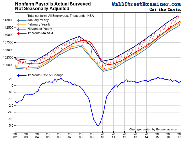
Can it possibly be that job formation in the US really grows in a straight line? Even with the NSA data, it’s as if job growth doesn’t fluctuate at all, outside of the seasonal pattern. That’s not reality. That’s the BLS using arbitrary formulas to project old data forward. They’re not counting the whole pie. They’re counting a crumb, and using a multiplier to make it look like the whole thing. But the problem is, you cannot tell at all what the pie looks like and tastes like, what it’s made of, from just a crumb. The crumb doesn’t contain all of the elements of the pie.
Those railroad tracks on that chart represent November, the month when the largest number of people are employed, and January when the fewest are employed. The gold line in the center shows the jobs for the current month, February, by year. The red line is the 12 month moving average. We expect that to move along a smooth curve. But seeing the other data move in perfectly shaped nearly straight curves, is suspicious, to say the least.
We know from tracking withholding taxes on a short term change basis, that the jobs growth really does fluctuate irregularly during the year. And yes, that data tends to indicate jobs growth running around 1.5% recently. The problem is that the BLS’s mechanical drawing method will not recognize trend change until well after the fact. So we need to keep our eye on other data.
Even with the withholding tax data smoothed to a 12 month MA, you can still see fluctuation. It is not a smooth curve. The current downtick may just be a pause. Or it may be something bigger. We’ll have a better idea whether it’s the beginning of trend change based on the more granular data I watch in my monthly reports on Federal Revenues.
Another series where the BLS takes a crumb and mechanistically projects it into a pie is the number of full time jobs. Look at the graph on the top of the chart. This is the NSA data on supposedly the number of full time jobs. Nice and smooth, and apparently as strong a growth rate as any of the prior recoveries since 1982.
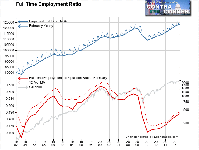
I take this back to 1982 for a reason. That is to show the number of full time jobs as a percentage of total population. That figure has been growing slowly since the beginning of the recovery. In fact, you can see that the slope of this recovery is slower than both the 1980s and 1990s expansions.
Furthermore, the number of full time jobs as a percentage of total population has not even recovered to the level of the bottom of the 1991-92 recession. So it’s a recovery, but a historically weak recovery, in spite of the world’s central banks pumping US stock prices up to an all time record. In addition to the slow growth is the fact that the majority of the new jobs have been low wage jobs, which we have illustrated elsewhere and will revisit.
The trickle down theory hasn’t worked in practice. Ben Bernanke’s high school social science project has failed miserably. In fact, his long running experiment is almost certainly responsible for helping to retard the recovery rather than stimulate it. A constant flow of free money has encouraged the diversion of financial resources from productive investment to speculation.
Finally, Professor Yellen, has given Bernanke’s project the F it deserves.The Fed will now administer the course of painful serum that the economy needs to rationalize productive investment, and perhaps recover in the long run. Things will get very ugly before they get better. The service sectors where most of the jobs growth has occurred, are likely to be particularly hard hit.
Follow Lee’s weekly market timing reports, including long and short ETF trading recommendations, in the Wall Street Examiner Pro Trader Market Updates. Try the service risk free for 90 days.

