
By Tim Knight At Slope Of Hope
The following was kindly contributed by Paul from Maine……..
I’ve been fiddling with some numbers in Excel and thought you’d find it interesting. It concerns the correlation of NYSE margin debt with the S&P 500.
Margin gives investors and traders the opportunity to borrow money in order to enhance their returns. NYSE margin debt concerns the aggregate value borrowed by all participants utilizing that particular exchange.
The figures shown will be in millions, so $400,000 is $400 billion; big moolah.
I became interested in margin debt after I had seen the following chart plastered on a few trading websites. Many of you may have seen it as well.
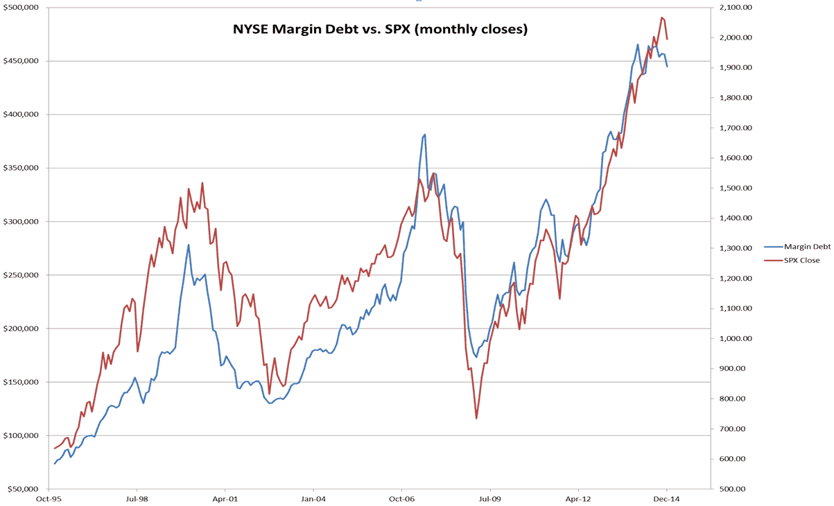
While the correlation is strong most of the time, the 2000 and 2007 tops stood out to me. Margin debt seemed to reach a peak, sell off hard, and then go nowhere as the S&Ps continued to make new closing highs.
Not being satisfied with just a chart, I collected data as far back as 1996 and threw it into a spreadsheet. NYSE margin debt data: (buuuut it’s easier to Google search “NYSE margin debt”) SPX close data provided by Yahoo! Finance (other sources are available).
First off, lets see how the correlation held during bull markets:
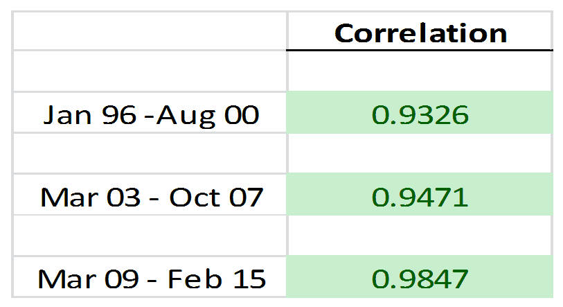
And how about those bear markets?

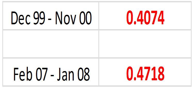
So what if I cherry pick the topping periods?
And here is a chart of the 12 month rolling window plotted against monthly SPX closes. Notice in the 2000 topping area how the warning came a little early; or could this be fallout from the 1998 correction? Happily, a second warning came just after the final high close. As the margin debt data does lag (it takes a month to get published), it helps to see candles with long tails (shooting stars and hanging men) to confirm.
In 2007 we see another dive in correlation as the last high close occurs and fades away.
Now in 2014 – 2015 we are again seeing a violation of the sub-60 area.

While this indicator does lag, that does not mean it loses its usefulness. For instance, some may argue that if the first warning in late 1998 to early 1999 were respected, a long portfolio would miss the potential for another 200 S&P points. Is that really so much? How often does one buy bottoms or sell tops perfectly? It kept the portfolio out of harm’s way.
Likewise, the 2007 top happened more quickly than 2000, so the signal was late. Even if 200 S&P points had been lost there were still another 600 to go.
For the short-side, say a trader was bearish in mid 2013. If he/she had been patient and waited for the breakdown in correlation, they would have a much better price to short at and have endured much less pain to boot!
Disclaimer:
This indicator is not the holy grail. If it confirms with divergences and oddities in other areas of the market, then maybe something really is happening here. By all means don’t mortgage the house (or reverse mortgage it).
But if the massive amount of borrowing to leverage returns is bothering you here, and you’re of the age where you can’t afford another bear market hit to your portfolio, maybe you’ll want to keep an eye on this.
I can’t wait to see how it unfolds.
The following was kindly contributed by Paul from Maine……..
I’ve been fiddling with some numbers in Excel and thought you’d find it interesting. It concerns the correlation of NYSE margin debt with the S&P 500.
Margin gives investors and traders the opportunity to borrow money in order to enhance their returns. NYSE margin debt concerns the aggregate value borrowed by all participants utilizing that particular exchange.
The figures shown will be in millions, so $400,000 is $400 billion; big moolah.
I became interested in margin debt after I had seen the following chart plastered on a few trading websites. Many of you may have seen it as well.
While the correlation is strong most of the time, the 2000 and 2007 tops stood out to me. Margin debt seemed to reach a peak, sell off hard, and then go nowhere as the S&Ps continued to make new closing highs.
Not being satisfied with just a chart, I collected data as far back as 1996 and threw it into a spreadsheet. NYSE margin debt data: (buuuut it’s easier to Google search “NYSE margin debt”) SPX close data provided by Yahoo! Finance (other sources are available).
First off, lets see how the correlation held during bull markets:
And how about those bear markets?
So what if I cherry pick the topping periods?
And here is a chart of the 12 month rolling window plotted against monthly SPX closes. Notice in the 2000 topping area how the warning came a little early; or could this be fallout from the 1998 correction? Happily, a second warning came just after the final high close. As the margin debt data does lag (it takes a month to get published), it helps to see candles with long tails (shooting stars and hanging men) to confirm.
In 2007 we see another dive in correlation as the last high close occurs and fades away.
Now in 2014 – 2015 we are again seeing a violation of the sub-60 area.
While this indicator does lag, that does not mean it loses its usefulness. For instance, some may argue that if the first warning in late 1998 to early 1999 were respected, a long portfolio would miss the potential for another 200 S&P points. Is that really so much? How often does one buy bottoms or sell tops perfectly? It kept the portfolio out of harm’s way.
Likewise, the 2007 top happened more quickly than 2000, so the signal was late. Even if 200 S&P points had been lost there were still another 600 to go.
For the short-side, say a trader was bearish in mid 2013. If he/she had been patient and waited for the breakdown in correlation, they would have a much better price to short at and have endured much less pain to boot!
Disclaimer:
This indicator is not the holy grail. If it confirms with divergences and oddities in other areas of the market, then maybe something really is happening here. By all means don’t mortgage the house (or reverse mortgage it).
But if the massive amount of borrowing to leverage returns is bothering you here, and you’re of the age where you can’t afford another bear market hit to your portfolio, maybe you’ll want to keep an eye on this.
I can’t wait to see how it unfolds.

