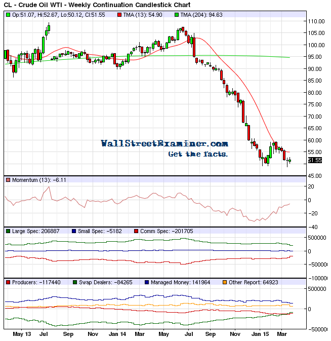
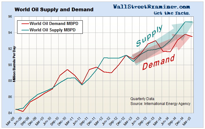
Crude oil is enjoying a rebound today, but that’s after a persistent pounding over the past two weeks that sent crude prices toward a test of the January-February lows. Forget the fancy economic analysis. Look at the charts. They show you exactly why crude has been under pressure. Supply exceeds demand. The price of oil will remain under pressure until demand starts growing faster than supply. So far, prices have not dropped enough to cause producers to cut back on supply.
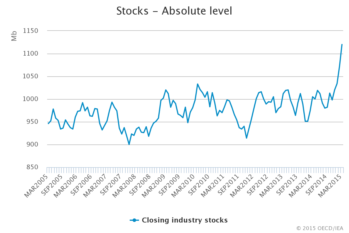
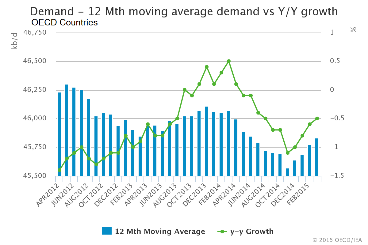
Data in these charts is the most recent available from the US Department of Energy (through May) for US data and the International Energy Agency (through Q1) for world data.


- OECD Crude Inventories– Click to enlarge

Because the international data has such a big lag, the price action itself could turn before the fundamental causes are revealed in the data. But price is set in the futures market, which can remain unhinged from supply-demand fundamentals for long periods. Oil speculators must trade the charts and leave the fundamentals for economists and financial journalists to fulminate over.
As for the price action, look to see what the smart money and dumb money are doing. Producers are still near record short and managed commodity funds are still heavily long and getting crushed. The double bottom may look tempting, but who wants to bet on a bottom here? Apparently not the smart money.