
Fed Finds “The End Of The Road”
The FOMC press conference yesterday made one thing abundantly clear; the Fed has lost control of the narrative and their credibility.
The problem stems from the Fed’s ongoing adherence to “data dependency.” Last December, when the Fed Funds rate was increased, the Fed discussed the potential for further rate hikes in 2016 as inflation and employment data strengthened.
However, in March, with employment and inflationary data improving combined with a strong rebound in the financial markets, the Fed opted to ignore their data and focus on “global risks” to hold rates steady.
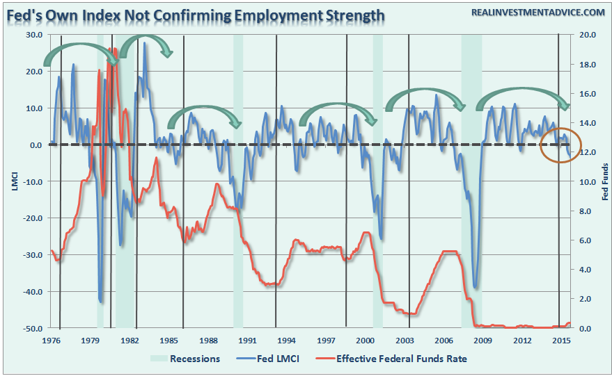
The problem for Ms. Yellen is while she was waiting to find the “perfect balance” of domestic growth and global stability, global economic weakness has now begun to destabilize domestic growth and employment. As the Fed’s own Labor Market Conditions Index shows, the rise in interest rates in December marked the peak in employment growth. Not unlike initial rate hikes have done every time previously.
Despite the perennial hopes of stronger economic growth, a resumption of employment trends and stronger inflation, the FOMC’s own projections clearly showed why they did not increase rates.
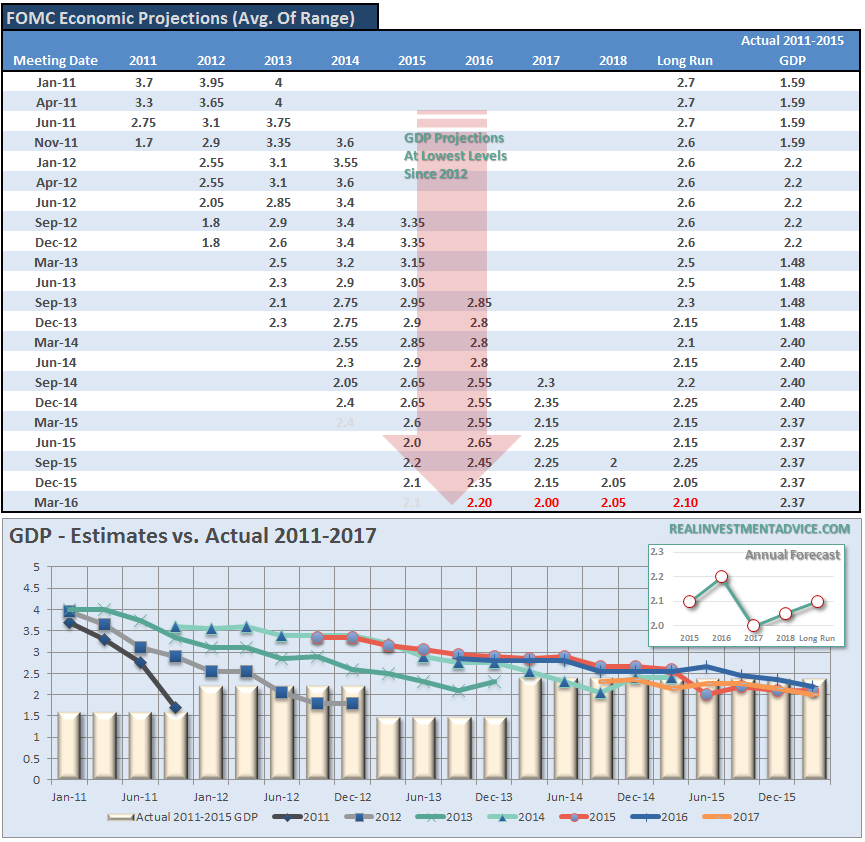
Besides being absolutely the worst economic forecasters on the planet, the Fed’s real problem is contained within the table and chart above. Despite the rhetoric of stronger employment and economic growth – plunging imports and exports, falling corporate profits, collapsing manufacturing and falling wages all suggest the economy is in no shape to withstand tighter monetary policy at this juncture.
Of course, if the Fed openly suggested a “recession” could well be in the cards, the markets would sell off sharply, consumer confidence would drop and a recession would be pulled forward to the present. This is why “what the Fed says” is much less important than what they do.
The big risk for the Fed has always been the market would “call their bluff” be unwilling to buy into the “forward guidance.” It is currently too soon to know for certain but reactions following yesterday’s announcement are not promising.
With the ECB and the Fed policy meetings behind us, for the moment, all eyes will turn back to economics and earnings.Unfortunately, neither one of those is particularly supportive at this juncture.
LMCI Pointing To Rise In Claims
One of the more regularly pointed to indicators the economy is “nowhere near a recession” is jobless claims which have been in a steady downtrend over the last few years.
Today’s release of the jobless claims saw an increase in claims to 277,000 in the most recent report up from 264,000 last month. Historically, when claims are below 300,000, the labor market should be running at or near capacity. The problem, this time, is while claims have fallen due to cost cutting, unemployment and underemployment remain problematic along with the suppression of wage growth.
This issue of “labor hoarding” explains the sharp drop in initial weekly jobless claims without a subsequent sharp rise in full-time employment, increased wages and stronger economic growth rates. In order to file for unemployment benefits, an individual must have been first terminated, by layoff or discharge, from their previous employer. An individual who “quits” a job cannot, in theory, file for unemployment insurance. However, as companies begin to layoff or discharge fewer workers the number of individuals filing for initial claims decline.
However, as shown in the chart below, it is NOT the decline in jobless claims, or the current level, but the reversal of claims which has historically denoted the onset of a recessionary drag in the economy.
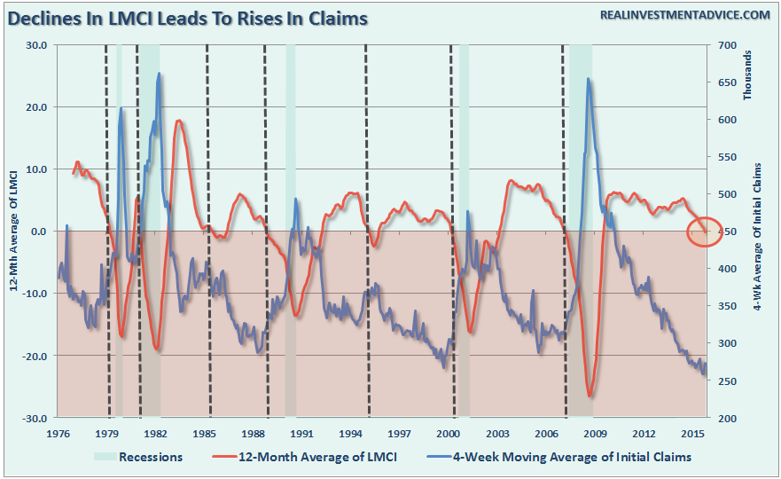
Furthermore, the decline in the Fed’s Labor Market Conditions Index was already warning of today’s uptick in claims and may be sending a stronger warning about the economy itself.
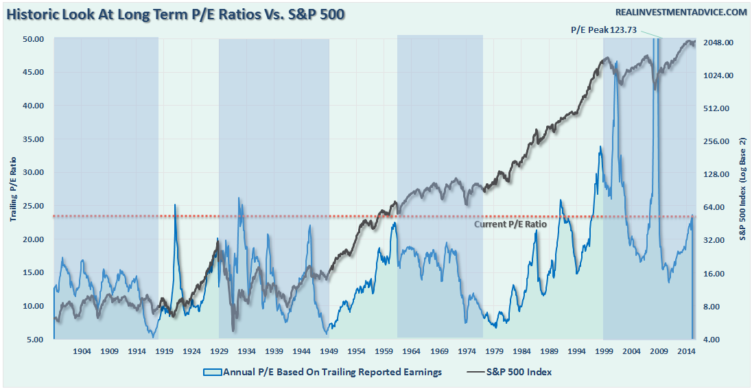
A More Timely Valuation Measure
One of the biggest criticisms of valuations, and one with which I agree, is the “timeliness” of the information provided. Historically speaking, market valuations and asset prices can remain elevated for far longer than logic would otherwise suggest.
Over the years, there has been much debate about the value of trailing valuations as a measure of portfolio management in the short-term while its value over the long-term has been abundantly clear.
The volatility of earnings from one year to the next is an inefficient predictor of market prices or returns over the short-term. This leads to the need to smooth earnings volatility in order to gain a better understanding of what the underlying trend of valuations actually is. From an investment standpoint, periods of “valuation expansion” are where the bulk of the gains in the financial markets have been made over the last 115 years. History shows, that during periods of “valuation compression”returns are much more muted and volatile.
Therefore, in order to compensate for the potential “duration mismatch” of a faster-moving market environment, I recalculated Robert Shiller’s CAPE ratio using a 5-year average as shown in the chart below.
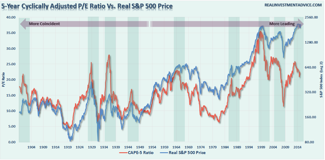
There is a high correlation between the movements of the CAPE-5 and the S&P 500 index. However, you will notice that prior to 1950 the movements of valuations were more coincident with the overall index as price movement was a primary driver of the valuation metric. As earnings growth began to advance much more quickly post-1950, price movement became less of a dominating factor. Therefore, you can see that the CAPE-5 ratio began to lead overall price changes.
A key “warning” for investors, since 1950, has been a decline in the CAPE-5 ratio which has tended to lead price declines in the overall market. While it is still very early, the CAPE-5 Ratio has declined from 25.77 in November of 2013 to 22.09 currently. The last time the CAPE-5 ratio started a similar decline was in February of 2011. Of course, that summer experienced a near 20% decline in the markets.
To get a better understanding of where valuations are currently relative to past history, we can look at the deviation between current valuation levels and the long-term average. The importance of deviation is crucial to understand. In order for there to be an “average,” valuations had to be both above and below that “average” over history. These“averages” provide a gravitational pull on valuations over time which is why the further the deviation is away from the“average,” the greater the eventual “mean reversion” will be.
The first chart below is the percentage deviation of the CAPE-5 ratio from its long-term average going back to 1881.
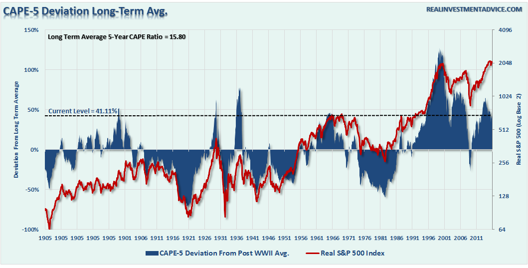
Currently, the 29.46% deviation above the long-term CAPE-5 average of 15.80x earnings puts valuations at levels only witnessed five (6) other times in history. While it is hoped “this time will be different,” which were the same words uttered during each of the five previous periods, you can clearly see that the eventual results were much less optimal.
However, by using a 12-month average of the CAPE-5 ratio to smooth out some of the volatility, we find that when the 12-month average turns down it has coincided with previously very important peaks in the stock market cycle.
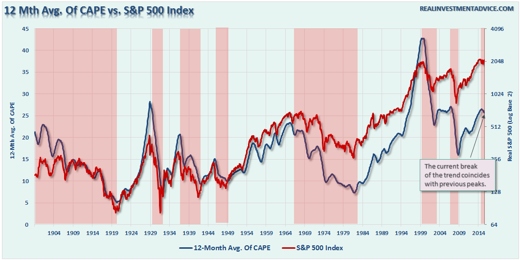
Is this a better measure than Shiller’s CAPE-10 ratio? Maybe, as it adjusts more quickly to a more highly volatile market. However, I want to reiterate that neither the Shiller’s CAPE-10 ratio, or the modified CAPE-5 ratio, were ever meant to be “market timing” indicators.
The purpose is to denote periods where carrying exceptionally high levels of investment risk have provided exceptionally poor levels of future returns. What both of these measures are clearly warning is that future market returns are going to be substantially lower than they have been over the past five years. Therefore, if you are expecting the markets to crank out 10% annualized returns over the next 10 years for you to meet your retirement goals, it is likely that you are going to be very disappointed.
Just some things to think about.
Lance Roberts

Lance Roberts is a Chief Portfolio Strategist/Economist for Clarity Financial. He is also the host of “The Lance Roberts Show” and Chief Editor of the “Real Investment Advice” website and author of “Real Investment Daily” blog and “Real Investment Report“. Follow Lance on Facebook, Twitter, and Linked-In

