
Since the end of the financial crisis, economists, analysts, and the Federal Reserve have continued to point to the monthly employment reports as proof of the ongoing economic recovery. Even the White House has jumped on the bandwagon as the President has proudly latched onto the headlines of the “longest stretch of employment gains since the 1990’s.”
Yes, there has definitely been an improvement in the labor market since the financial crisis. I am not arguing that point. The financial markets, investors, and analysts eagerly anticipate the release of the employment report each month while the Federal Reserve has staked its monetary policy actions on them as well.
My problem is the discrepancy between the reports and what is happening in the underlying economy. The chart below shows employment gains from 1985-2000 versus wages and economic growth rates.

As compared to 2000-2016.

See the problem here?
IF employment was indeed growing at the fastest pace since the 1990’s, then wage growth, and by extension, economic growth should be at much stronger levels as well. That has YET to be the case.
Part of the reporting problem that has yet to corrected by the BLS is the continued overstatement of jobs through the “Birth/Death Adjustment” which I addressed recently in greater detail.
“For example, take a look at the first slide below.”
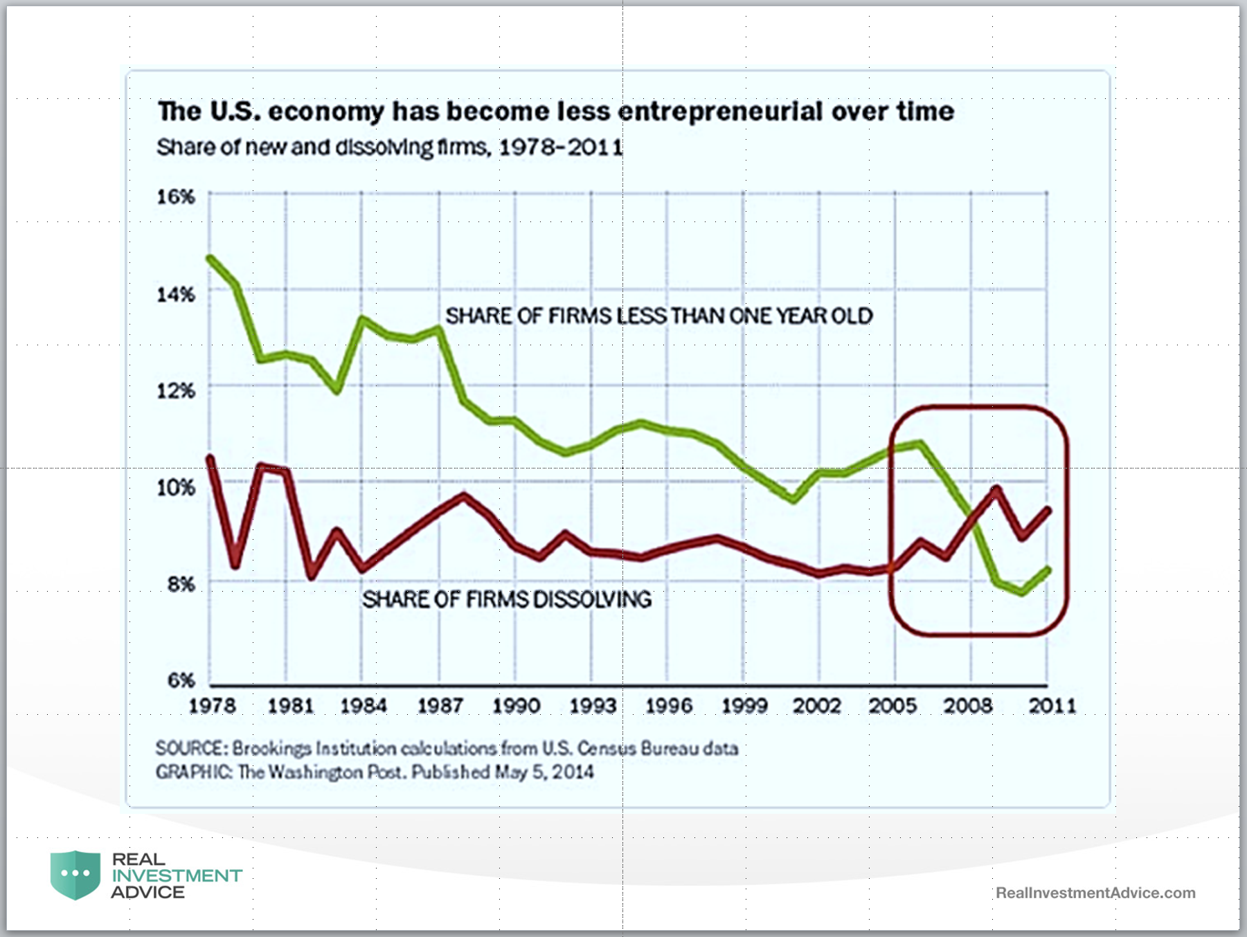
“This chart CLEARLY shows that the number of “Births & Deaths” of businesses since the financial crisis have been on the decline. Yet, each month, when the market gets the jobs report, we see roughly 200k plus jobs.
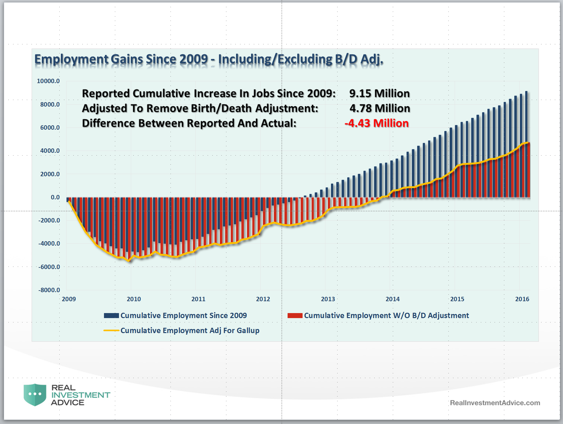
Included in those reports is an ‘ADJUSTMENT’ by the BEA to account for the number of new businesses (jobs) that were “birthed” (created) during the reporting period. This number has generally ‘added’ jobs to the employment report each month.
The chart below shows the differential in employment gains since 2009 when removing the additions to the monthly employment number though the “Birth/Death” adjustment. Real employment gains would be roughly 4.43 million less if you actually accounted for the LOSS in jobs discussed in the first chart above.”
Think about it this way. IF we were truly experiencing the strongest streak of employment growth since the 1990’s, should we not be witnessing:
- Surging wage growth as a 4.9% unemployment rate gives employees pricing power?
- Economic growth well above 3% as 4.9% unemployment leads to stronger consumption?
- A rise in imports as rising consumption leads to demand for goods.
- Falling inventories as sales outpace production.
- Rising industrial production as demand for goods increases.
None of those things exist currently.
Unreal Retail
Furthermore, as Jeffrey Snider just addressed, the surging jobs in “retail sales” does not jive with actual retail sales. To wit:
“On the sales side, the last year has been appreciably worse than the dot-com recession and recovery yet employment is moving in the exact opposite direction and with that strange intensity of late. Not only are employment figures showing a more robust hiring scenario now than the late 1990’s, the pace is significantly better than even the housing mania of the middle 2000’s. From April 2003 until August 2005, retail sales clearly accelerated, with the overall average 6.0% during those two and a half years (and the short-term, 6-month MA 7.25% by the end of them). It would make sense, then, that hiring would be sustained and relatively robust, with the BLS suggesting 458k total new retail jobs to go along with those increasingly better sales estimates.”

“That means we have worse than dot-com recession levels in terms of sales over the past year from early 2015, but not the contraction in retail employment that went along with them prior. Instead, the BLS suggests that hiring is more robust now than during either the heights of the dot-com or housing bubbles even though sales are nowhere near those periods.”
Something is clearly amiss in what is happening in retail trade. We are likely going to see fairly sharp negative revisions to the data when the BLS eventually gets around to accounting for “retail reality.”
Profits Drive Employment
Let’s set all of the above data points aside for a moment and just talk about the single most important driver of employment – profits.
Business owners are the single most astute allocators of capital on the planet. Why? Simple. If businesses continually misallocate capital over an extended period of time, they will not be in business for long. If sales are declining – companies tend to reign in hiring as a defense against falling profitability. If profits are declining due to cost increases, like spiraling healthcare premiums, employment tends to be curtailed. Employment, which is the largest expense for companies, is driven by the rise and fall of profits.
I have smoothed the annual variability of inflation-adjusted corporate profits with real GDP to provide a clearer picture of its relationship to the annual rate of change in employment.

We are currently witnessing what is very likely the peak in employment for the current economic cycle. With layoff announcement rising from virtually every sector of the economy, it will likely not take much more economic weakness to see a rise in unemployment rates.
LMCI Leads
Lastly, the Fed’s on Labor Market Conditions Index (LMCI) tends to lead the overall change in the BLS employment reports. The chart below is a 12-month average of the LMCI as compared to the annual change in employment.

Despite the Fed’s “jawboning” about the strength of the labor market as a reason to “normalize” interest rates, their own indicator likely confirms why they have not done so as of yet. The historic correlation is extremely high and the recent divergence will likely not last long as the LMCI approaches ZERO growth. With economic data continuing to weaken, it will likely not be long before employment reports begin to consistently miss overly optimistic expectations.
It is quite evident there is something amiss about the BLS’ employment reports. Is the disparity simply an anomaly in the seasonal adjustments caused by the depth of the financial crisis? Is there an exceptional and unaccounted for margin of error in the surveys? Or, is it something more intentional by government-related agencies to keep “confidence” elevated as Central Banks globally “paddle like crazy” to keep global economies afloat.
I honestly don’t know those answers. I do know the only question that really matters is:
“Who gets to the end of the race first?”
Lance Roberts

Lance Roberts is a Chief Portfolio Strategist/Economist for Clarity Financial. He is also the host of “The Lance Roberts Show” and Chief Editor of the “Real Investment Advice” website and author of “Real Investment Daily” blog and “Real Investment Report“. Follow Lance on Facebook, Twitter, and Linked-In

