
Last week we reviewed the US industrial production (IP) and saw that it contracting for more than a year. The IP indexes represent the production of factories, mines, and utilities in unit volume, not dollar sales, both by total output and output by industry. While these indexes do not represent service industries directly, they do indirectly because electric power production and distribution feeds service business.
The IP indexes give us a pretty good idea of how the US economy is performing overall and by industry. Let’s just say it’s not the picture of health. The industrial production data includes breakdowns by industry and sector which can tell us a great deal more about the state of the US economy. It’s worse than the headline writers would have you believe. I promised in the report last week to illustrate some of that data for you.
One of the divisions of IP is an energy index and a non energy index. We all know that there was a tremendous oil and gas production boom from 2009 to 2014. The last couple of years of that were a bubble. Prices kept rising in spite of the fact that supply was persistently outpacing demand. The traders in the futures markets ignored the physical market fundamentals and continued driving prices higher. Big money saw oil as a money substitute, and the big money bought the futures as a hedge against central bank money printing.
Prices kept rising and producers kept producing. That helped US industrial production to grow very strongly in the first 2 years of the “recovery” from the 2009 recession low, then at a slower pace until 2014 when IP peaked.
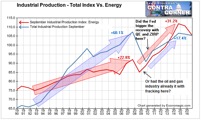
From 1992 to 2007 energy production was a laggard. While total IP grew by 60% over that 15 year span, energy production grew only 23%. Then came the crash, but something else was happening. In 2006-07 the fracking boom got off the ground. It pulled back only slightly during the recession of 2007-09 and at various points each year (not shown on this chart) actually made new all time highs. The energy boom really began to accelerate in 2009-2010. So did the Fed trigger the recovery from the recession low with QE and ZIRP beginning in 2009? Or did the energy boom actually pull the economy up by its bootstraps?
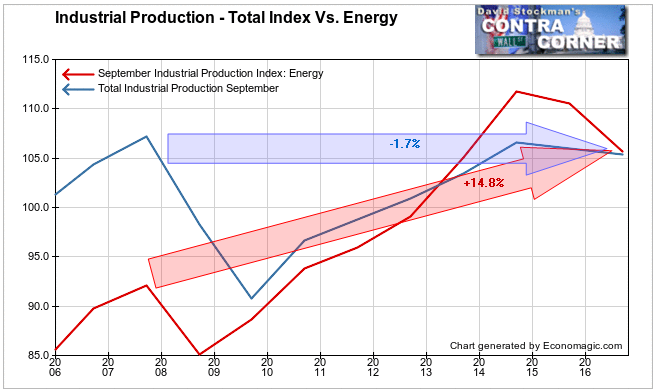
Between the recession low in 2008 and the energy bubble peak in 2014 the Energy IP index rose by 31.2%. Total IP lagged Energy, and rose only 17.4% from its low in 2009 to its peak in 2014. Both Energy and total IP have fallen since 2014. Energy production has crashed by 5.4%, helping to pull total IP down by 1.1%. That leaves total IP down 1.7% since 2007 while Energy IP is still up 14.8%.
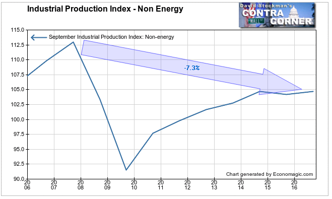
Where does that leave Non Energy IP? It has been essentially flat over the past 2 years. The recovery has stalled. Population growth alone should have driven IP growth of a couple of percent. It hasn’t been there. So it’s not just the Energy sector that is weakening. In fact Non Energy industrial production is now 7.3% lower than it was in 2007. That’s not a recovery. A decline of 7.3% after 9 years is a depression.
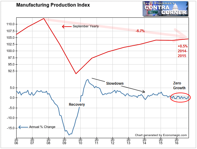
Some of that is in manufacturing. The vaunted US manufacturing recovery has been stalled for a year. There was a bungee rebound after the 2009 recession low, but it began to decelerate in 2010, gradually falling to the current 0 growth rate.
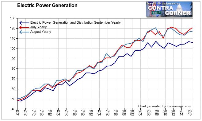
Finally, Electric Power and Distribution IP is a record of the electricity produced and served to virtually all households and businesses in the US. In the summer, including September, electricity production can be boosted by air conditioning use in especially warm weather. This September was cooler than last and electricity production fell. But both August and July were below their peak average temperatures set in 2012 and 2011 respectively.
To some extent the electric power IP mirrored the temperature patterns. In August electricity generation and distribution declined year to year. Maybe it was the weather, maybe not; because this series is still below it’s 2007 peak and the 2015 peak. There has been no growth for 9 years. The same is true for the long term pattern in July and August. In the short run it tends to follow temperatures, but over the past 9 years there has been no growth in August either. July production peaked in 2011.

This isn’t normal. The US population is always growing. Electric power use should be growing at at least the same rate as population, and more than that to indicate economic growth. In fact, electric power generation had been persistently uptrending in the 33 years in which this data had been collected prior to 2007. Then it just stopped. This is just one more sign that the US has been a no growth no growth economy since 2007. Does that justify stock prices being 37% higher since then?
You know the answer.
Lee Adler first reported in 2002 that Fed actions were driving US stock prices. He has tracked and reported on that relationship for his subscribers ever since. Try Lee’s groundbreaking reports on the Fed and the forces that drive Macro Liquidity for 3 months risk free, with a full money back guarantee.

